


Cover Story
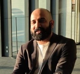
Nothing Phone (4a) Pro Review: Mid-Range Pricing, Flagship Ambitions
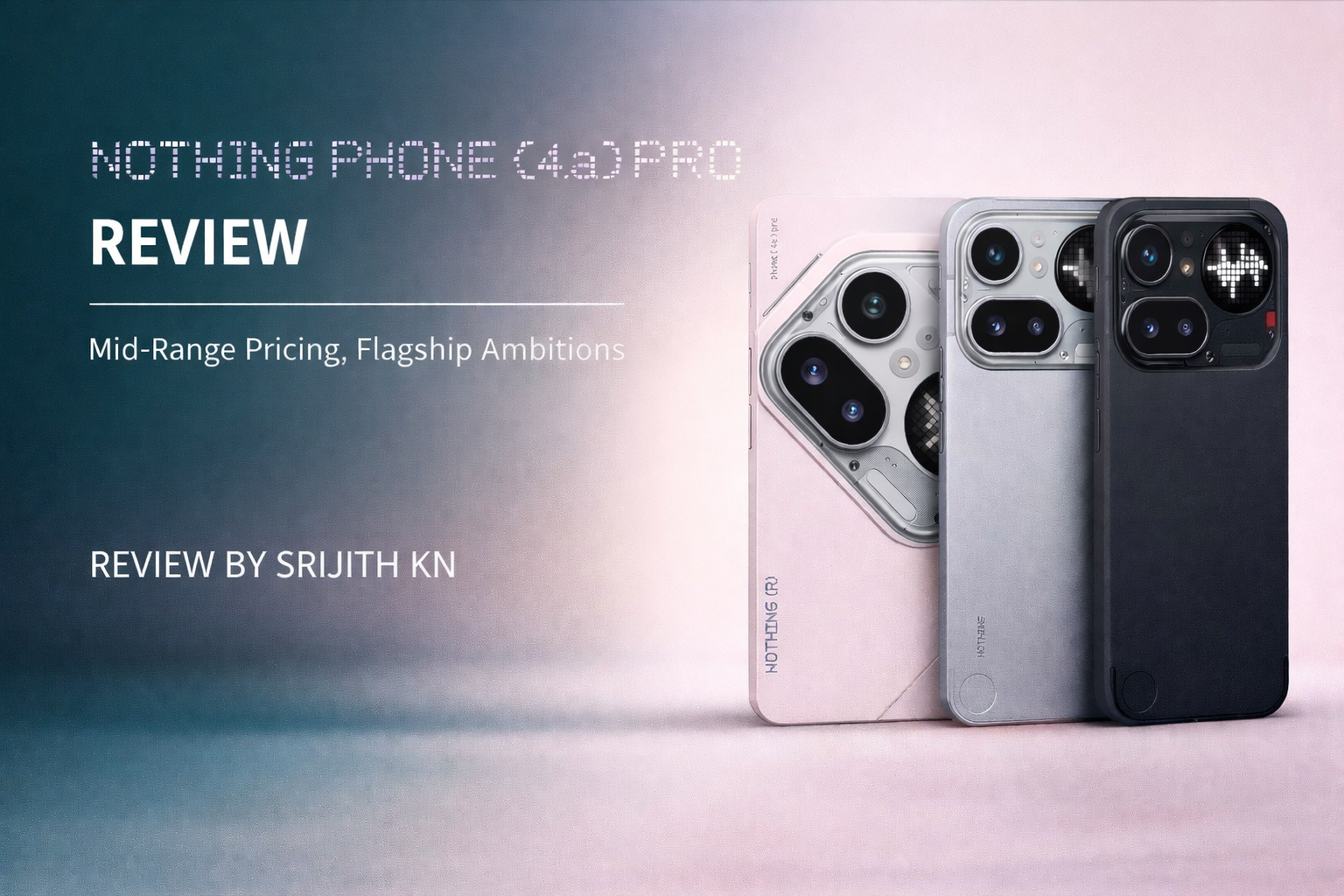
By Srijith KN
An in-depth look at Nothing’s 4a Pro, the clean stylish looking mid-range powerhouse!
Nothing has built its reputation on standing apart in an increasingly crowded smartphone market. With the launch of the Nothing Phone (4a) and the more ambitious Nothing Phone (4a) Pro, the company continues that philosophy while shifting its positioning. While the standard model focuses on accessibility, the Pro model moves closer to the premium segment, combining refined hardware with one of the most impressive displays in its category.
The Design Shift

The first thing that stands out about the Phone (4a) Pro is its departure from Nothing’s signature transparent aesthetic. Instead of the exposed internal design language that defined earlier models, the Pro adopts a more traditional and solid look with a clean metal frame and a conventional camera bump. At just 7.95mm, it is also the slimmest Nothing phone to date.
It is a different direction, but one that works. The device feels noticeably more premium than its price might suggest. Having used Nothing phones extensively, including the Phone (1) for nearly two years and the Phone (3) as a daily driver, this design shift feels like a more mature step for the brand. For some users, the move toward a more understated look may actually increase its appeal.
A Display Built for Immersion
The Phone (4a) Pro features a large 6.83-inch AMOLED display with a 1.5K resolution and a variable 144Hz refresh rate. On paper, these specifications are already top tier for this price range.
In practice, the display delivers exactly what those numbers promise. The screen feels fast and responsive with extremely smooth scrolling, while peak brightness reaching up to 5000 nits ensures excellent outdoor visibility. For everyday use, the combination of size, speed, and brightness makes the device feel significantly more expensive than its mid-range positioning suggests.
Performance That Surprises
Powering the device is the Snapdragon 7 Gen 4 chipset paired with up to 12GB of RAM. While this chipset is not designed to compete with flagship processors, it represents a meaningful performance jump compared with previous mid-range Nothing devices.
In early testing, the phone handled multitasking comfortably and performed well in gaming scenarios. Nothing has always focused on smooth real-world performance rather than chasing benchmark numbers, and the Phone (4a) Pro continues that same philosophy. For most users, the device feels quick, responsive, and capable of handling everyday workloads without difficulty.
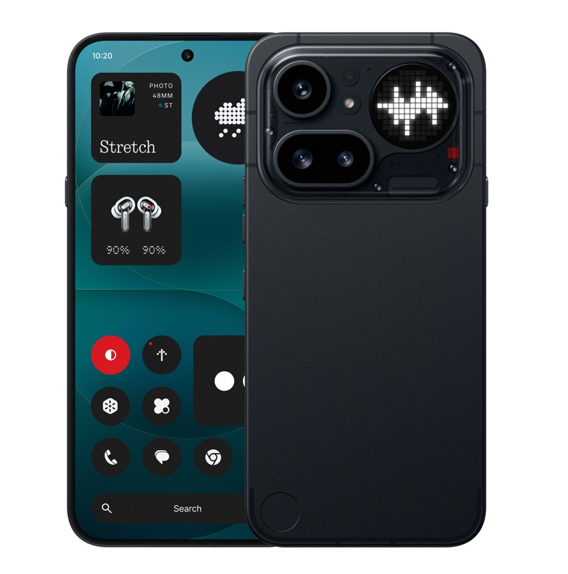
Nothing OS Remains a Strength
Nothing OS continues to be one of the strongest aspects of the device. The software experience remains clean, responsive, and refreshingly free from unnecessary bloatware.
In a smartphone landscape increasingly filled with overly aggressive AI features and cluttered interfaces, Nothing OS stands out for its simplicity. For users who prefer a lightweight Android experience that stays focused on usability, the software remains one of the Phone (4a) Pro’s biggest competitive advantages.
Camera Performance
The Phone (4a) Pro includes a 50-megapixel main camera supported by a telephoto lens designed to offer additional versatility for photography.
In good lighting conditions the camera produces detailed images with balanced colour reproduction. While it may not fully compete with flagship level camera systems, the overall performance remains strong for the device’s price category.
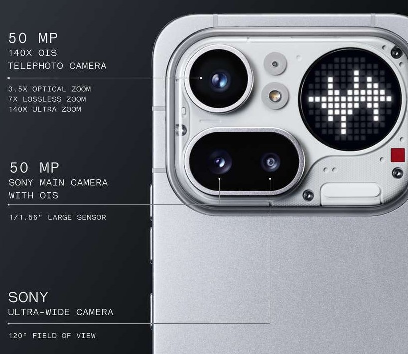
However, there are some compromises. The ultra-wide camera uses an 8MP sensor and the front facing camera represents a slight downgrade compared with higher end models in the Nothing lineup. For most users the results will still be more than sufficient, but the camera system does not completely match flagship expectations.
The 140× Zoom Experiment
One of the more unusual features on the Phone (4a) Pro is the advertised 140× zoom capability. On paper this sounds extraordinary, particularly for a mid-range device.
In practice the phone achieves this through a combination of its 3.5× optical telephoto lens and AI driven image processing that digitally extends the zoom range far beyond what the optics alone can provide.
Testing the feature reveals a surprisingly practical use case. While extreme zoom levels will not replace traditional photography, the ability to zoom into distant text or objects and capture a quick shot to inspect them works well. The heavy lifting appears to come from AI processing, which sharpens the image enough to make those faraway details readable.
Carl Pei once mentioned in an interview that some features come from giving internal teams the freedom to experiment creatively. The 140× zoom feels like one of those ideas. It may not always produce perfect photos, but it works surprisingly well as what could be described as a “digital binocular” mode.
The Glyph System: Refined Identity

The Glyph lighting system remains one of Nothing’s most recognisable design signatures. On the Phone (4a) Pro the concept evolves with a larger and brighter light array that expands its visual notification capabilities.
The Glyph system can display alerts for incoming calls, timers, notifications, and recording indicators through distinctive lighting patterns on the back of the phone.
While visually distinctive and occasionally useful for quick notifications, the Glyph system still feels more like a signature design element than a practical necessity. That said, the implementation on the Phone (4a) Pro looks particularly striking and continues to give Nothing devices a visual identity that few other smartphones offer.
Editor’s Impressions
Having moved from the Phone (1) to the Phone (3) as my primary device, the Phone (4a) Pro feels like an interesting pivot for Nothing. The shift away from a fully transparent aesthetic toward a polished metal design feels both refreshing and more mature.
Performance is strong enough for everyday use and even moderate gaming, while the display is easily one of the highlights of the device. The camera system is capable, though there are a few compromises including the 8MP ultra-wide lens and the slightly downgraded front camera.
For users looking for the absolute highest specifications available, there are other devices that push further into flagship territory. But that has never been Nothing’s core philosophy. Instead, the brand focuses on creating devices that feel distinctive, practical, and thoughtfully designed.
For users who want a smartphone with a strong personality without paying flagship prices, the Nothing Phone (4a) Pro offers a compelling balance of style, performance, and value.


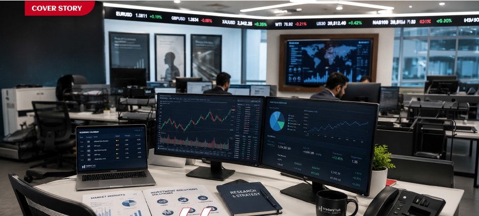
Traders’ Hub’s Michael Barbour on investor trust, technology, and the future of finance in the Gulf.
BY SRIJITH KN FOR FINANCIAL INTEGRATOR
Over the past few years, investor participation across the region has evolved beyond speculative trading activity into something far more structured, technology-driven, and institutionally aligned. Retail traders are becoming increasingly sophisticated, expectations around transparency and execution quality are rising, and financial platforms are under pressure to offer far more than simple market access.
The speculative frenzy that once defined large parts of retail trading is gradually giving way to a more measured investor mindset, shaped largely by regulation, financial awareness, and long-term wealth preservation rather than short-term market excitement.
In this changing landscape, brokerage firms are no longer positioning themselves purely as trading providers. Instead, many are beginning to evolve into broader financial ecosystems, combining infrastructure, education, technology, regulatory credibility, and long-term investment access into a single platform experience.
For UAE-based firms such as Traders’ Hub Capital Markets, this shift represents more than market expansion. It signals a transformation in how the region’s next generation of investors may engage with financial markets altogether.
Founded in 2022 and headquartered in Abu Dhabi, Traders’ Hub has rapidly positioned itself as a locally regulated, technology-enabled brokerage focused on transparency, multi-asset access, and client-centric trading infrastructure.
Today, the company offers access to more than 2,000 instruments across forex, commodities, equities, indices, and cryptocurrencies, while simultaneously preparing for a broader move into wealth management and long-term investment services.
But the story surrounding Traders’ Hub is not simply about growth.
It is also about the wider evolution of the UAE’s financial ecosystem itself.
THE SHIFT IN UAE INVESTOR CULTURE
Across the GCC, financial participation is changing shape.
The rapid rise of digital platforms, increasing financial literacy, regulatory modernization, and mobile-first investing have fundamentally altered how younger investors interact with markets.
In parallel, the UAE has continued strengthening its position as a regional financial hub, attracting capital, fintech innovation, institutional activity, and globally mobile investors seeking regulated access to international markets. This transformation has also created new expectations.
Today’s investors are increasingly prioritising transparency, regulatory protection, execution quality, multi-asset accessibility, and seamless digital experiences.
In many ways, expectations around trading platforms are beginning to resemble expectations traditionally associated with banking and wealth management institutions.
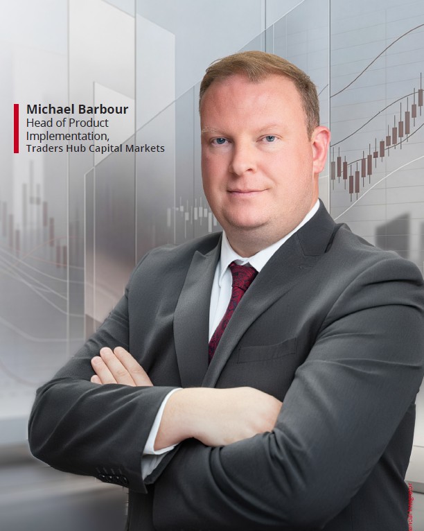
According to Michael Barbour, Head of Product Implementation at Traders’ Hub Capital Markets, these changes reflect a deeper transformation in investor behaviour itself.
“Investors increasingly seek integrated, trustworthy financial ecosystems prioritising long-term value, convenience, and institutional-grade service.”
Over the past five years, the psychological profile of the UAE investor has gradually shifted from short-term speculation toward a far more informed, disciplined, and globally aware mindset. Earlier retail participation was often driven primarily by leverage, speed, and short-term market movements. Today, however, younger investors across the UAE are becoming more research-driven, risk-conscious, and focused on long-term wealth creation rather than impulsive trading behaviour.
Modern traders are also seeking far more than market access alone. Transparency, educational support, analytical tools, platform stability, and institutional credibility are becoming increasingly important components of the investor experience itself.
FROM SCOTLAND TO GULF CAPITAL MARKETS
Long before helping shape the growth trajectory of Traders’ Hub Capital Markets, Michael Barbour’s early ambitions were far removed from financial markets.
Growing up in Stonehaven, a small Scottish town south of Aberdeen, he originally aspired to become a professional footballer, eventually playing semi-professionally before moving into finance.
His early exposure to financial systems came during the 2008 financial crisis while working within the legal and asset management sector in Scotland, assisting major UK banking institutions in managing distressed real estate portfolios during one of the most volatile periods in modern financial history.
That experience, combined with his later move to the Middle East in 2011 and subsequent years at the Dubai Gold and Commodities Exchange (DGCX), helped shape a perspective grounded not only in trading infrastructure, but in how markets behave under pressure, uncertainty, and rapid transformation.
Today, that institutional perspective continues influencing Traders’ Hub’s broader focus on operational credibility, technology infrastructure, and long-term investor engagement across the UAE market.
BUILDING A LOCALLY ROOTED TRADING PLATFORM
One of Traders’ Hub’s strongest positioning advantages lies in its status as a UAE-regulated Category 1 Capital Markets Authority (CMA) licensed broker, one of the highest licensing classifications within the country’s financial ecosystem.
In a market where offshore platforms have historically dominated retail participation, regulatory credibility has become increasingly significant, particularly as investors grow more conscious of operational risk, fund protection, execution transparency, and long-term platform reliability.
Rather than positioning itself through aggressive speculative messaging, Traders’ Hub appears to be building its identity around institutional-grade infrastructure, operational discipline, and client alignment.
Its trading environment is built around a Straight Through Processing (STP) execution model, meaning trades are routed directly to liquidity providers rather than internally warehoused by the broker itself.
In increasingly crowded financial markets, brokerage differentiation is no longer being shaped purely by leverage offerings or execution speed. Investors across the UAE are becoming far more conscious of pricing transparency, liquidity structures, operational credibility, and how trades are ultimately executed, particularly as financial literacy continues maturing across the region.
According to Michael Barbour, many investors still misunderstand how brokerage models differ operationally, particularly around spreads, slippage, pricing structures, and conflicts of interest between market-making and STP environments.
For Barbour, transparency itself is becoming a defining factor in long-term investor confidence.
Modern investors are also becoming more selective around how brokers disclose execution policies, fee structures, liquidity relationships, and client fund protections. In many ways, execution architecture itself is increasingly becoming part of the trust equation.
For regulated regional firms such as Traders’ Hub, this shift may ultimately represent a broader advantage. As investor sophistication continues evolving across the UAE, operational credibility and institutional transparency are beginning to matter as much as platform functionality itself.
FROM BROKERAGE TO FINANCIAL ECOSYSTEM
The transition from Traders’ Hub Currency Brokerage to Traders’ Hub Capital Markets reflects more than a naming evolution. It signals a broader ambition to position the company as a longer-term financial institution within the UAE’s evolving investment ecosystem.
Globally, the distinction between trading platforms, investment platforms, and wealth management ecosystems is beginning to blur. Increasingly, investors no longer want fragmented financial experiences spread across multiple platforms. Instead, they are seeking connected environments capable of combining active trading, long-term investing, financial planning, analytics, and educational support within a single ecosystem.
For Traders’ Hub, this transition also reflects an effort to solve a longstanding regional friction point: the difficulty many UAE investors face when moving between active trading and structured long-term wealth accumulation.
“The modern investor no longer wants isolated trading access. They want a complete financial environment,” says Barbour.
The company’s planned expansion into wealth management and broader investment services reflects a wider regional shift toward more integrated financial participation models.
TECHNOLOGY, AI, AND THE NEXT INVESTOR EXPERIENCE
As trading platforms become increasingly automated and algorithmically assisted, the financial industry is also confronting a deeper question: how much of investing should remain human?
Technology is rapidly becoming the defining layer of modern financial platforms, from AI-assisted analytics and mobile-first investing experiences to increasingly sophisticated execution infrastructure.
But while automation can enhance speed and efficiency, long-term investing still remains deeply shaped by human behaviour itself. Markets continue being influenced by fear, overconfidence, emotional reaction, and risk perception, factors technology alone cannot fully eliminate.
One potential differentiator for firms such as Traders’ Hub may therefore lie in how effectively they balance algorithmic intelligence with human judgement.
EDUCATION, TRUST, AND LONG-TERM ENGAGEMENT
As trading participation expands across the GCC, financial platforms are increasingly carrying responsibilities extending far beyond market access alone.
While digital platforms have lowered barriers into global financial markets, they have also intensified conversations around behavioural investing, financial literacy, emotional discipline, and long-term risk awareness.
Increasingly, sustainable platform growth may depend not only on user acquisition, but on trust, transparency, and investor education itself.
In the GCC particularly, where retail participation continues expanding rapidly, financial firms are beginning to recognise their role in shaping long-term investor behaviour and financial understanding.
THE NEXT PHASE OF REGIONAL FINANCE
The UAE’s financial landscape is evolving rapidly.
As regulation strengthens, investor sophistication increases, and technology continues reshaping how capital moves through markets, financial platforms and capital markets institutions are being forced to rethink what they represent within the broader financial ecosystem.
The company’s broader direction, spanning infrastructure investment, wealth management expansion, AI integration, mobile accessibility, and educational initiatives, reflects a wider regional transition toward more mature, technology-enabled financial participation.
Barbour believes the future of finance will increasingly belong to intelligent platforms capable of combining technology, trust, education, accessibility, and long-term wealth creation into a unified experience.
Whether this next generation of financial platforms ultimately succeeds will depend not only on execution speed or product breadth, but on something far more enduring: trust.
And in an increasingly crowded financial landscape, trust may ultimately become the most valuable asset of all.
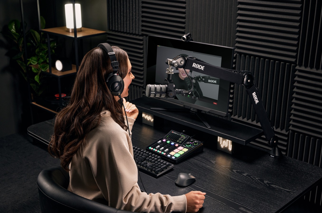
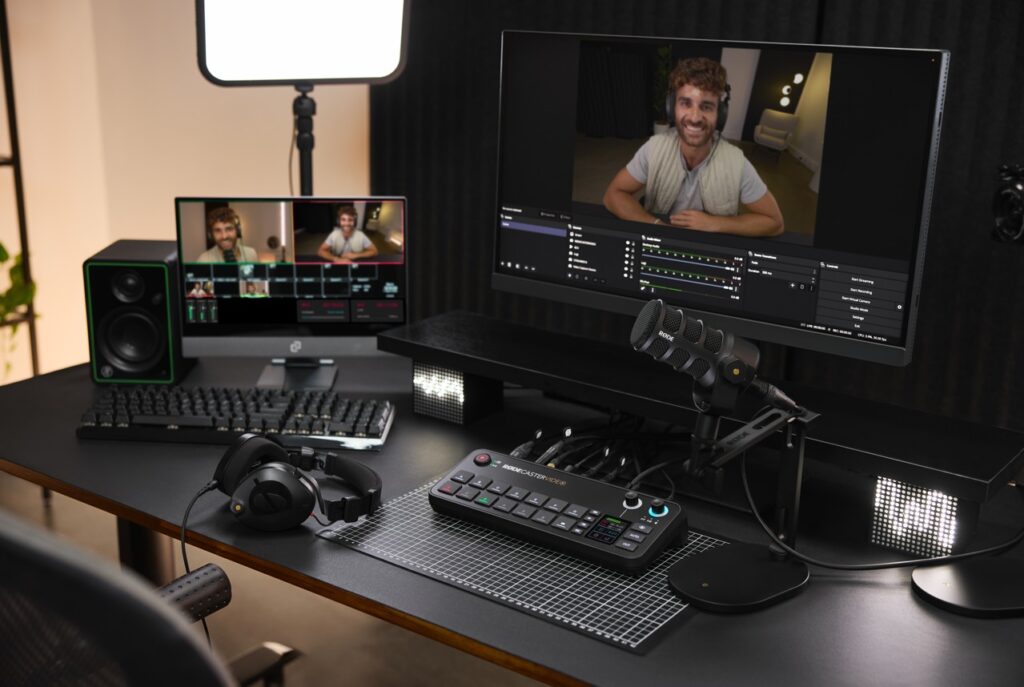
Walk into any modern content setup today, whether it’s a podcast studio, a corporate webinar room, or a hybrid event environment, and you’ll see a familiar pattern, one that reflects how fragmented the content production stack has become.
A microphone connected to an interface.
An interface connected to a laptop.
A laptop running multiple layers of software to mix, switch, stream, and record.
It works, but it’s rarely seamless.
Because the biggest challenge in content creation today isn’t access to tools, it’s understanding how they all fit together.
The Real Problem: Too Many Tools, Too Little Clarity
The rise of podcasting and video content has created a new kind of friction. Users are no longer asking what they can create; they are asking how to make the tools work together.
Recording audio separately, syncing video later, transferring large files to high-end machines, and relying on multiple software layers have become the default workflow. It works, but it is inefficient, expensive, and prone to failure.
The expanding ecosystem of devices, features, and formats has made even basic setup decisions unnecessarily complex.
When it comes to products from RØDE, users & creators already recognize the product’s potential to simply clarify and help elevate the overall workflow experience.
From Tools to Unified Systems
This is where the shift begins to stand out.
What we are seeing is not simply the addition of new features, but the consolidation of functions.
Mixer. Recorder. Audio interface. Video switcher. Stream encoder.
What traditionally required a stack of hardware and software is now being brought into a single console environment.
For creators, that simplifies production.
For enterprises, it changes how content infrastructure is designed.
As this shift gains momentum, it is also being acknowledged at a leadership level.

“Real innovation isn’t about adding more; it’s about removing friction and enhancing workflows.
Kalinda Atkinson,
With the introduction of platforms like the RØDECaster Video, we’re starting to see audio and video unified in one system, unlocking faster, more focused creative output.”
Global Marketing Director, RØDE
Why This Matters Beyond Creators
This shift is not limited to podcasters or streamers. Enterprises are increasingly building in-house content studios, executive communication channels, internal video platforms, and hybrid event capabilities as part of their broader communication strategy.
In these environments, complexity quickly becomes a bottleneck. Multiple tools often translate into longer setup times, increased points of failure, and a growing dependency on technical operators to manage what should ideally be straightforward workflows.
A unified system begins to reduce that friction, allowing teams to focus less on managing the process and more on the output itself.
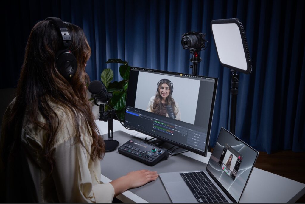
The End of the Laptop-Centric Setup
One of the most significant changes is subtle: the laptop is no longer central.
With recording, streaming, and switching built directly into the console, content can now be produced without relying on external software or intermediary platforms. Audio and video routing happens natively within the system, removing the need to manage multiple layers of tools.
This, in turn, reduces reliance on tools like OBS Studio and lowers the need for high-performance machines in the production chain.
Broadcast Capabilities, Simplified
Features that were once limited to broadcast environments are now being integrated directly into compact systems. Capabilities such as multi-camera switching, ISO recording with separate tracks for each input, audio-based automatic switching between speakers, and network-driven video workflows like NDI are no longer confined to high-end production setups.
For enterprise teams, this translates into professional-grade production without the need for dedicated control rooms or complex broadcast infrastructure.
Modularity Signals Long-Term Thinking
Another important shift lies in how these systems evolve over time.
With expansion options such as adding video capabilities to existing audio consoles, RØDE is enabling a more modular approach to production. Instead of replacing entire systems, users can extend them based on their needs.
This becomes particularly relevant for organizations that may begin with audio-first content using consoles such as the RØDECaster Duo or RØDECaster Pro II, gradually expanding into video production with consoles such as RØDECaster Video, RØDECaster Video S, or even the RØDECaster Core, and scaling internal media capabilities over time. The result is a more flexible investment model that reduces upfront costs while supporting long-term growth.

A Shift in the Competitive Landscape
On the surface, this still appears to sit within the audio hardware category. In practice, however, it competes with something far broader.
As these systems begin to handle capture, processing, and output within a single environment, they start to overlap with production software ecosystems, video switching platforms, and content workflow tools.
The implication is clear: when orchestration happens within the system itself, the need for external layers begins to diminish.
The Opportunity Ahead
As the layers of complexity fade, creators will have more time for creative storytelling and less time worrying about the setup.
The new products and technology from RØDE not only remove setup barriers, but they also enable creators & enterprises to operate at a full professional standard, accelerating both the creativity and innovation ecosystems.
Srijith KN covers enterprise technology, media infrastructure, and digital transformation across the Middle East.

“Cloud waste isn’t created by bad engineers. It’s created by systems that show problems too late. Once I saw that, it became clear, the solution wasn’t better reporting. It was prevention.” – Atmoz CEO Yael Shatzky
Yael Shatzky didn’t set out to build a company around cloud costs. What she noticed, after more than 25 years across enterprise technology, product marketing, and growth at organisations including Amdocs and Microsoft’s R&D ecosystem, was a pattern.
Not just rising cloud spend, but a deeper structural disconnect in how it’s managed.
If you were introducing yourself and Atmoz to someone outside tech, where would you begin?
I’d say I’m building a company that changes how people think about waste—specifically cloud and AI waste.
Imagine a house where electricity prices constantly change depending on what you use and when, but no one knows the cost. Lights stay on, AC runs all day, and while you know you’re wasting about 30%, you have no way to prevent it. The only signal you get is last month’s bill.
That’s how companies operate in the cloud today.
Atmoz changes that by bringing cost awareness into the moment decisions are made, helping teams make smarter choices without disrupting how they work. The result is simple: waste is prevented before it happens.
What is the core problem Atmoz is solving—and where has the market gone wrong?
The market has focused on visibility, dashboards and reports that explain what already happened.
But the problem isn’t visibility.
It’s timing.
By the time companies see the data, the money is already spent and systems are already in production. Even with perfect visibility, nothing changes.
Atmoz works at the moment engineers are building, engaging them with immediate, simple recommendations that don’t slow them down. That’s where prevention becomes possible.
What does ‘AI-first’ product development look like at Atmoz?
We built a data foundation that reconstructs cost signals as resources are created, before billing data exists. That’s the hard part.
On top of that, we use AI where it matters most: interaction and execution. Our AI agent takes accurate, contextual data and delivers actionable recommendations directly within developer workflows.
Because the system is grounded in precise data, the guidance isn’t just intelligent, it’s reliable and immediately usable.
What are the biggest challenges in getting engineers to trust AI-driven recommendations?
Interestingly, it’s not trust in AI, it’s the belief that prevention is even possible.
For years, companies have been told they can reduce costs, yet around 30% of cloud spend is still wasted. That’s because most tools analyse waste after it happens, they don’t stop it.
Once engineers see an issue flagged in real time, with clear context and a simple fix, the skepticism disappears. It becomes tangible.
What is one leadership mistake that fundamentally changed how you operate?
Focusing too much on the product, and not enough on marketing early on.
Great products don’t speak for themselves, especially when you’re creating a new category. Marketing isn’t something you layer on later; it shapes how the product is understood and adopted. Starting early makes a significant difference.
Where do you see the biggest inefficiencies today?
The biggest inefficiency is the disconnect between engineering decisions and their financial impact.
Every time a developer deploys infrastructure or triggers an AI workload, they’re making a financial decision, without visibility into its cost implications.
AI is amplifying this. Costs are more volatile, and traditional feedback loops can’t keep up.
Atmoz brings cost awareness into that decision point, making efficiency part of the engineering discipline, much like security became over time.
At this stage, how do you define success?
Success isn’t a single milestone, it’s a series of moments.
Signing a new customer. Launching a capability that impacts spend. Getting a call from a customer excited because they just saved $30K on something they didn’t even know was happening.
Those moments are what drive us forward.
You’re defining a new category. What does it take to change long-held assumptions?
It starts with conviction. You’re asking people to question something they’ve accepted as normal.
But conviction alone isn’t enough, proof is everything. Category change happens when someone sees it working in their own environment and has that “aha” moment.
That’s why we focus on immediate, tangible value. When waste is prevented in real time, the mindset shift follows naturally.
Resilience also matters. When you challenge established models, you will be dismissed. The key is to stay grounded in the problem and keep showing evidence.
Has the industry been solving cloud waste the wrong way? Why hasn’t it changed?
I wouldn’t say wrong, FinOps tools solved the problem they were designed for. They brought visibility and governance, which was critical.
But they were built on the assumption that cost is something you analyse after it happens.
Today, cost is created instantly, when infrastructure is provisioned or AI workloads run. But feedback still comes later. That gap is the issue.
What’s changed is the pace of engineering. With AI, decisions are faster and costs are more dynamic. What used to be inefficient is now unsustainable.
That’s why prevention isn’t just an improvement, it’s becoming essential.
How will engineering teams work differently in five years?
Cost will no longer be treated as something external, owned by finance. It will become part of the engineering feedback loop, like performance or reliability.
Atmoz brings that awareness into everyday workflows, guiding better decisions without adding friction.
Over time, this shifts behaviour. Waste isn’t something you detect and fix later, it simply doesn’t get created.
The result is not just lower cost, but faster teams, better decisions, and more room to innovate.

SAN CARLO, THE ITALIAN RESTAURANT UAE TRAVELLERS ARE BOOKING THIS LONDON SUMMER
SERENITY – THE ART OF WELL BEING CELEBRATES ITS 10TH ANNIVERSARY

FIRE AND FLAVOUR: RODEO DRIVE IBN BATTUTA GATE TEASES THE LAUNCH OF ITS NEW FOOD MENU


-
News11 years ago
SENDQUICK (TALARIAX) INTRODUCES SQOOPE – THE BREAKTHROUGH IN MOBILE MESSAGING
-

 Trending9 months ago
OPPO A6 Pro 5G Review: Reliable Daily Driver
-

 Tech News2 years ago
Denodo Bolsters Executive Team by Hiring Christophe Culine as its Chief Revenue Officer
-
 VAR1 year ago
Microsoft Launches New Surface Copilot+ PCs for Business
-

 Automotive2 years ago
AGMC Launches the RIDDARA RD6 High Performance Fully Electric 4×4 Pickup
-
Tech Interviews2 years ago
Navigating the Cybersecurity Landscape in Hybrid Work Environments
-

 Tech News1 year ago
Nothing Launches flagship Nothing Phone (3) and Headphone (1) in theme with the Iconic Museum of the Future in Dubai
-

 VAR2 years ago
Samsung Galaxy Z Fold6 vs Google Pixel 9 Pro Fold: Clash Of The Folding Phenoms